


Kathryn Devoe
Opinion Editor
[email protected]
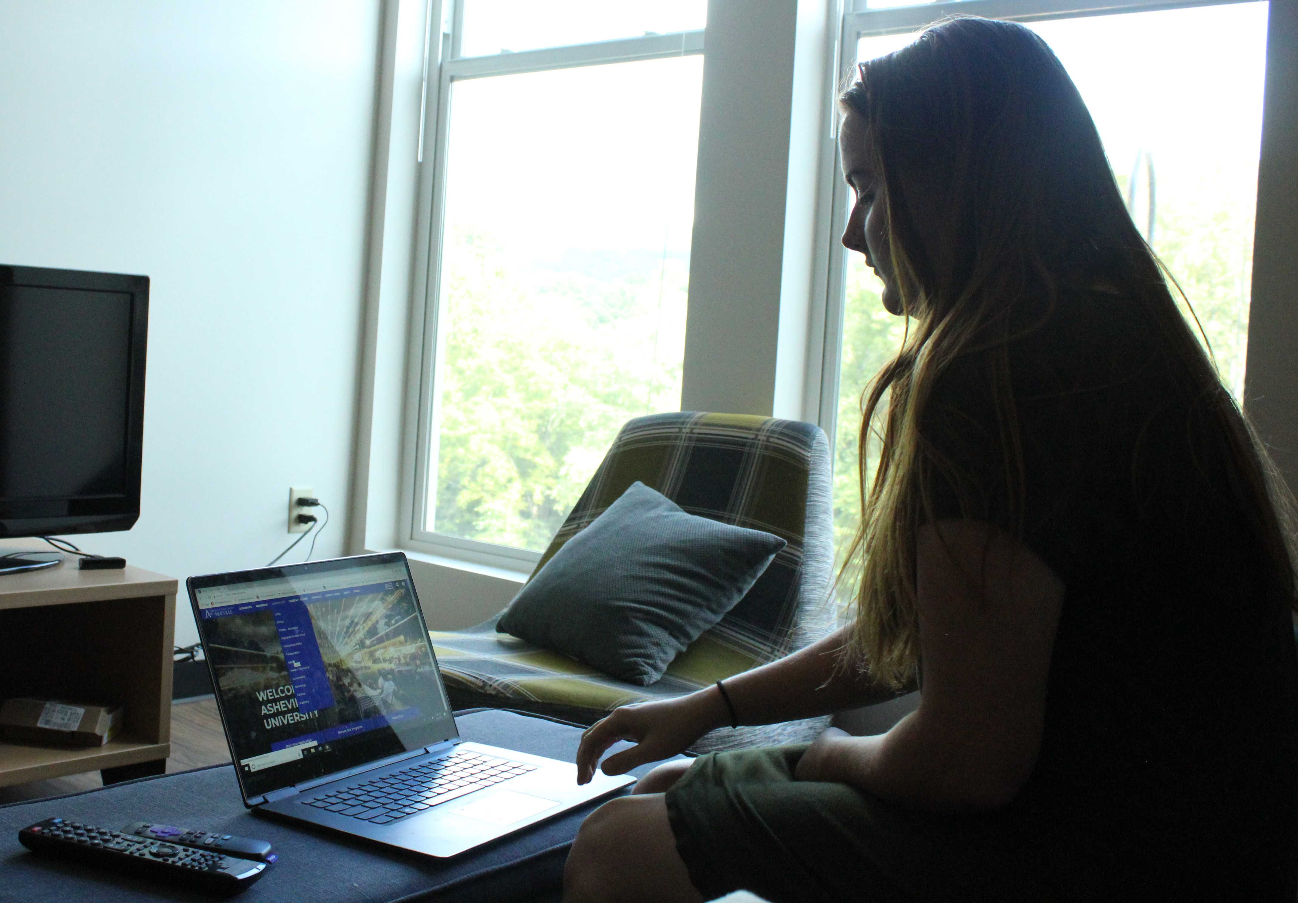
Students, faculty and staff struggle to find access to Moodle from the main UNC Asheville website after it was redesigned. UNCA’s web presence lost ease of accessibility when it shifted their target audience from individuals involved at the college to potential students.
UNCA is an academic institution and we should focus on students and staff currently here to make life easier for them.
Adam Reagan, interim chief information officer, said the target audience of website changed.
“There has been a big shift to make sure that we are effectively communicating and attracting prospective students, donors, community members and much of the content that you see on today’s home page is definitely geared toward that audience,” Reagan said.
The change of audience on the UNCA website lessened the convenience of the home page. I think the links to Moodle and OnePort should be explicitly marked and easy to find, but I can’t quickly find the links anymore.
Venea King, a senior psychology major, recognized the new website was different.
“With the website, I’ve just noticed a few issues. I have noticed that it’s hard to navigate and search for specific things,” King said. “You’ll find no results when you know that information is in the system or it should be in the system.”
Reagan said the Moodle button remains as part of the home page.
“We didn’t get rid of Moodle, we just moved it. It is now on the bottom of every page, it’s the top link in the footer of every page,” Reagan said. “It is actually the third most clicked link on our website.”
The location of the Moodle link seems very inconvenient and confusing. I would never think that something essential to academics should be at the bottom of a website. I didn’t know the Moodle button existed on the website still until Reagan told me.
King said the last website was better in some ways.
“I loved the way that it was up at the top. The last website was just more convenient,” King said.
The updated homepage features an icon of a person’s head in the upper left corner which leads to OnePort, but it is not explicitly labeled OnePort. Reagan said there’s a reason for that.
“There’s a login button, it doesn’t say OnePort and that’s intentional because moving forward with a new version of OnePort we’re probably not going to call it OnePort anymore,” Reagan said. “OnePort is a term that we’ve had as an institution for the last 12 to 15 years.”
The changes of the Moodle and OnePort buttons means students, faculty and staff struggle with the accessibility of knowledge. UNCA is a higher learning institution which means knowledge and learning should be easily accessible, but this value doesn’t show through on their webpage.
Reagan said the new OnePort would hopefully be up and running for the spring semester.
“One of the biggest shifts in this platform is going to be able to provide you with content based on your role or your interests here at the institution,” Reagan said. “So it’s very much like social media.”
OnePort confuses many students as they try to find their class schedules and accept financial aid packages. The UNCA website and OnePort honestly needed an update.
Reagan said UNCA used Drupal, an open source software to create websites, for the past ten years and the website was updated about every 3 years.
“So as we took a look at the technology for what our new site was going to be based on, we really took a hard look at the latest version of Drupal and WordPress and ultimately the decision was made to move toward WordPress,” Reagan said.
Reagan said the updated home page on WordPress launched, but many of the other UNCA sites continue to be on Drupal because this was only the core launch.
“We still have some sites that are running on Drupal eight, but we will be working with the rest of campus throughout the rest of the calendar year and probably into the beginning of the spring semester to migrate their existing sites to the new WordPress platform,” Reagan said.
The web presence of UNCA seems to be a developing project, but it has some negative implications for students, faculty and staff. I noticed the drastic difference between the department websites and the home page that the update created.
Assistant Literature Professor Evan Gurney said he was struggling with the home page.
“It’s really difficult to navigate and it’s difficult to find some of the central functions for a teacher or a student at this university,” Gurney said.
The update has negative aspects for people already involved with the website. Educational links have more importance being front and center on the UNCA website than buttons like apply and take a tour for prospective students.
King said she was hopeful for the UNCA presence online.
“I just kind of worry about the functionality of it. I’m hoping that this is just the beginning and they’re going to add on to to it,” King said.